DKirwan / calendar-heatmap
- среда, 16 марта 2016 г. в 02:12:52
JavaScript
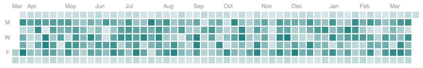
A d3 heatmap representing time series data similar to github's contribution chart
A d3.js heatmap representing time series data. Inspired by Github's contribution chart
gh-pages branch| Property | Usage | Default | Required |
|---|---|---|---|
| data | Path to data to render on the chart | none | yes |
| selector | DOM selector to attach the chart to | body | no |
| colorRange | Array of colors to use as a gradient in the chart | ['#D8E6E7', '#218380'] | no |
| tooltipEnabled | Whether it shows a tooltip or not | true | no |
1: Include the calendar-heatmap.js code after d3.js and moment.js
<script src="path/to/calendar-heatmap.js"></script>
2: Format the data so each array item has a date and count property.
As long as new Date() can parse the date string it's ok. Note - there all data should be rolled up into daily bucket granularity.
3: Configure the chart and render it
// chart data example
var chartData = [{
  date: valid Javascript date object,
  count: Number
}];
var chart1 = calendarHeatmap()
              .data(chartData)
              .selector('#chart-one')
              .colorRange(['#D8E6E7', '#218380'])
              .tooltipEnabled(true);
chart1(); // render the chart...are very welcome!