52inc / Scoops
- вторник, 28 июня 2016 г. в 03:13:43
Java
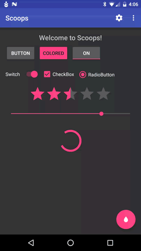
Android library for managing and applying multiple themes and custom theme modification

Android library for managing and applying multiple defined R.style.Theme.... themes at runtime for dyanically changing the look and feel of your application
Add this line to your gradle/dependencies group:
compile 'com.52inc:scoops:0.1.0'Then you will need to initialize the singleton in your Application subclass like this:
Scoop.waffleCone()
        .addFlavor("Default", R.style.Theme_Scoop, true)
        .addFlavor("Light", R.style.Theme_Scoop_Light)
        .addDayNightFlavor("DayNight", R.style.Theme_Scoop_DayNight)
        .addFlavor("Alternate 1", R.style.Theme_Scoop_Alt1)
        .addFlavor("Alternate 2", R.style.Theme_Scoop_Alt2, R.style.Theme_Scoop_Al2_Dialog)
        .setSharedPreferences(PreferenceManager.getDefaultSharedPreferences(this))
.initialize();Basic usage is to call the .apply(...) method in your activities before you call setContentView(R.layout.some_layout) like this:
@Override
protected void onCreate(Bundle savedInstanceState) {
    super.onCreate(savedInstanceState);

    // Apply Scoop to the activity
    Scoop.getInstance().apply(this);

    // Set the activity content
    setContentView(R.layout.activity_main);

    ...
}
You can also use .applyDialog(...) to apply the specified dialog theme resource to an activity (to make an activity appear as a dialog with the correct theme)
There are a few custom attributes you can use to make sure your application has the correct styling when switching themes. These are:
<attr name="toolbarTheme" format="reference" />
<attr name="toolbarPopupTheme" format="reference" />
<attr name="toolbarItemTint" format="reference|color" />
Then in your layouts, apply the toolbar themes like so:
<android.support.v7.widget.Toolbar
        ...

        android:theme="?attr/toolbarTheme"
        app:popupTheme="?attr/toolbarPopupTheme"

        />
Then define the attribute in your themes like this:
<style name="Theme.Scoop" parent="Theme.AppCompat.NoActionBar">
    ...
    <item name="toolbarTheme">@style/ThemeOverlay.AppCompat.Dark.ActionBar</item>
    <item name="toolbarPopupTheme">@style/ThemeOverlay.AppCompat.Light</item>
    <item name="toolbarItemTint">#fff</item>
</style>
You can also apply the toolbarItemTint color to all the icons in the toolbar by calling .apply(Context, Menu)
This library provides a built in theme chooser settings screen to use called ScoopSettingsActivity that you can use by utilizing one of it's static Intent factories:
ScoopSettingsActivity.createIntent(Context);
ScoopSettingsActivity.createIntent(Context, R.string.some_title_to_use);
ScoopSettingsActivity.createIntent(Context, "Some title to use");You can access beta by adding these lines to your gradle configuration:
allprojects {
    repositories {
        jcenter()
        maven { url "https://oss.sonatype.org/content/repositories/snapshots/" }
    }
}
compile 'com.52inc:scoops:0.2.1-SNAPSHOT'This is the ability to have a view or attribute update it's color (background, src, text, etc) whenever the user/developer chnages the color for a defined property, or Topping. Please refer to Sample App for actual code references.
For example:
Toolbar mAppBar;

@Override
public void onCreate(Bundle savedInstanceState){
    super.onCreate(savedInstanceState);
    setContentView(R.layout.some_layout);

    Scoop.sugarCone().bind(this, Toppings.PRIMARY, mAppBar)
                     .bindStatusBar(this, Toppings.PRIMARY_DARK);
}

void onSomeEvent(){
    Scoop.sugarCone().update(Toppings.PRIMARY, someColorInt)
                     .update(Toppings.PRIMARY_DARK, someDarkColorInt);
}
There are two annotations to use to binding views and the like to color properties that can be dynamically updated (i.e. palette, etc) which are @BindScoop() and @BindScoopStatus().
The former binds a View to a color property and the later binds an activities status bar color to a property. For Example:
@BindScoopStatus(Toppings.PRIMARY_DARK)
public class MainActivity extends AppCompatActivity {

    @BindScoop(Toppings.PRIMARY)
    @BindView(R.id.appbar)
    Toolbar mAppBar;

    @BindScoop(
            value = Toppings.ACCENT,
            adapter = FABColorAdapter.class,
            interpolator = AccelerateInterpolator.class
    )
    @BindView(R.id.fab)
    FloatingActionButton mFab;

    @Override
    protected void onCreate(Bundle savedInstanceState) {
        super.onCreate(savedInstanceState);
        setContentView(R.layout.activity_main);

        // Bind ButterKnife
        ButterKnife.bind(this);

        // Bind Scoops
        Scoop.sugarCone().bind(this);

        ...
    }

    @Override
    protected void onDestroy() {
        Scoop.sugarCone().unbind(this);
        super.onDestroy();
    }
}
Then just all update to the color properties like shown earlier
This is just they initial feature set. Soon I will streamline this with Annotation Processor, and add in plugin abilities to easily tie in the likes of Palette and other libraries as well as refine the API and make it more fluent.
Copyright (c) 2016 52inc

Licensed under the Apache License, Version 2.0 (the "License");
you may not use this file except in compliance with the License.
You may obtain a copy of the License at

    http://www.apache.org/licenses/LICENSE-2.0

Unless required by applicable law or agreed to in writing,
software distributed under the License is distributed on an
"AS IS" BASIS, WITHOUT WARRANTIES OR CONDITIONS OF ANY KIND,
either express or implied. See the License for the specific
language governing permissions and limitations under the License.